
An Americano and a Website

Let’s go for coffee together.
PICTURE IT:
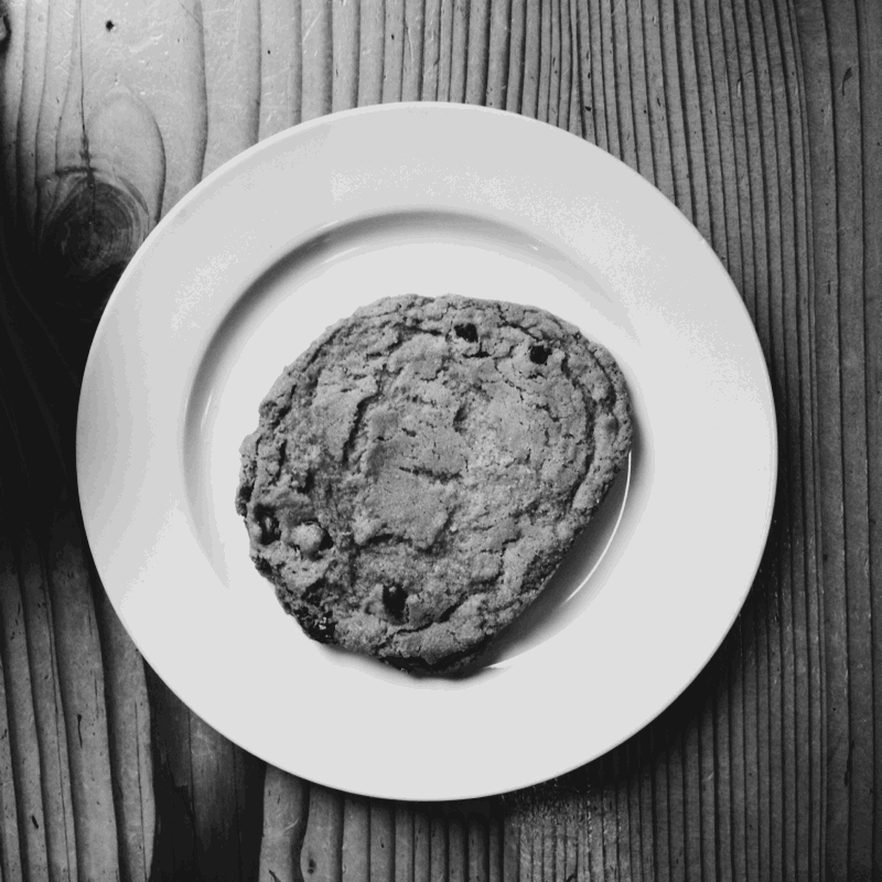
You are in a cafe surrounded by noise and people. Coffee grinders are squealing and the barista is perfecting your Americano. Out the window there are cars driving past. Someone is walking their dog along the sidewalk. You get your coffee and a chocolate cookie (who can resist!) and sit down. You open your laptop at the table and your desktop is covered in pictures and files. You proceed to open your browser to Google then hop on over to Facebook for a quick scan of your newsfeed. While there, amidst the stream of friends and social media highlights, you see a link for an interesting website and you click on it.
BAHM! YOU’RE ON THEIR WEBSITE.
You quickly glance left to right, read a sentence, skim past a few more and start scrolling down. Your mind is distracted by the other windows open on your computer and everything else that is happening around you in the cafe. You decide you’d like to listen to your favourite podcast while you simultaneously explore the website. You pop open iTunes, stick in your earbuds, take a bite of your cookie and back to the website. Your attention is now split between listening to the podcast and “reading” the website. You want to find what you need quickly and easily. Does the website speak to you? Is it interesting? Does it make you want to stop everything else that you are doing so you can focus and explore? Or does it make you want to bounce back to Facebook never to return again? Let’s take a break from this metaphor.
THIS SCENE IS THE REALITY OF HOW USERS ENGAGE WITH CONTENT ONLINE.
As we all know, a website can be viewed in a multitude of environments. It is not a static image hung on a specific wall. It’s part of our experience out in the world. It is framed by life and we all have a hell of a lot going on. I’m starting to feel overwhelmed just writing this and it’s how we are all living our lives every single day.
SO, WHAT DOES THIS MEAN TO US WHEN WE THINK ABOUT WEB DESIGN?
To me, intelligent information architecture, fool proof navigation and legibility are some of the most important things to consider. We need to embrace simplicity and think critically about everything we include on a website. Everything from content to functionality needs to have a desired purpose. Here are three main points to consider.
1) INTELLIGENT INFORMATION ARCHITECTURE
When someone first lands on your website, you have exactly 7 seconds to let them know exactly what you do and if it’s for them. Think Ninjutsu style communication! Your business name, tagline and intro sentence needs to say it all.For all other sections of your website, clear decisive headings are very effective. Anyone who has ever read a newspaper or magazine has seen this done effectively. The New York Times is a great case study. What sections of your content need great headings? If someone were merely to scan the pages of your website, would they be able to figure out what each section was about without having to read any further? Does the heading grab their attention and make it irresistible to keep from reading?
2) FOOL PROOF NAVIGATION
For navigation, keep it really simple. This is the place to be predictable - blatantly boring even! Use the navigation terms everyone is familiar with so that there is no confusion (about, services, blog, etc.). I encourage creative thinking everywhere else but here.

3) LEGIBILITY
Typography choices are the key to legibility. Body copy should be easy on the eyes. Save scripts and other more embellished fonts for headings or subheadings, if you need to use them. Make sure that the length of each line of text does not extend too long. Research has shown that lines that are too long will be overwhelming to the mind and will discourage reading and engagement. It is also important that fonts are large enough. A nice squint resistant size font will make your users want to keep reading. And last but certainly not least, is white space. Give people a chance to absorb the content. White space (or negative space) is just as important as the space that is filled with imagery and content. White space allows the mind to focus and integrate information. Less is more.
The online world is an attention economy. Attention is finite, and therefore scarce. So if you want people to pay attention to you, you need to earn it.” - Mark McGuinness
So, if you only had a few minutes to make an impression on a person in a really busy cafe who just drank another Americano and ate a giant chocolate chip cookie (thank you 2% Jazz!), then what would you do differently?
To your unbridled success,
Brooke